Your Disabled Buttons Are Killing Your Product's Conversions – Here’s What to Do Instead
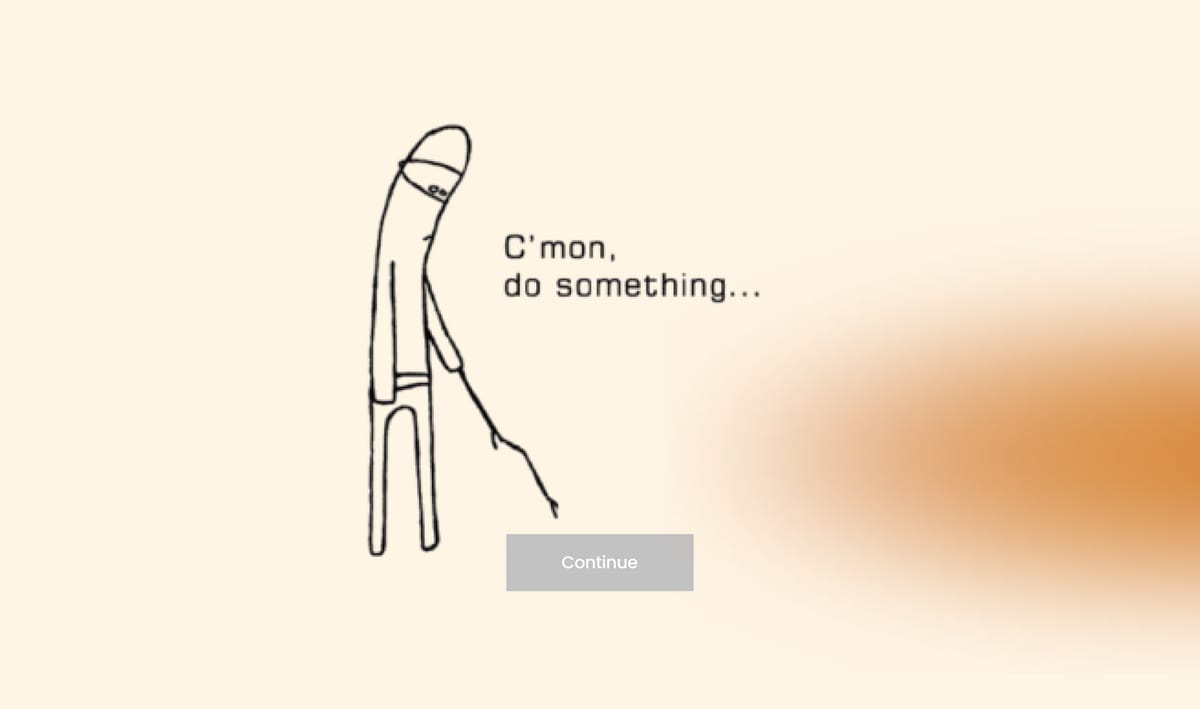
Picture this: you're navigating through a digital interface, ready to complete a crucial action—submitting a form, advancing to the next stage—but as you hover over the button, nothing happens. It's disabled. Frustration sets in. What went wrong?
This scenario is all too familiar in the digital landscape, where disabled buttons serve as silent roadblocks, leaving users stranded. In this article, we'll explain why disabled buttons often cause confusion among users, explore the underlying factors, and provide insights into how designers can address this challenge. By the end of this article, you will get a comprehensive list of questions that will set you up for success anytime you create a new user interface or validate an existing one.
Downsides of Disabled Buttons
Visual Similarity
Disabled buttons often look similar to enabled buttons in terms of color, shape, and placement. Users may not immediately notice the difference, especially if the visual cues are subtle. This can lead them to believe that the disabled button is functional or that they missed something and are not able to proceed.
Lack of Feedback
Users often expect feedback when interacting with UI elements. Without clear indications as to why a button is disabled and how to enable it, users may repeatedly click on it in confusion. interface can feel broken
There are cases where the user can input an answer that they think is valid but the system expects something else. Without a clear sign that this is not expected, the disable button will stay in the same state without indicating the user why this is happening. As a result, users will come to the conclusion that your product isn't working.
Accessibility Issues
Users with certain disabilities, such as visual impairments, may find it challenging to distinguish between enabled and disabled buttons if the visual cues are not clearly defined. Lack of proper contrast, size, or other accessibility considerations can exacerbate this issue.
How to guide users
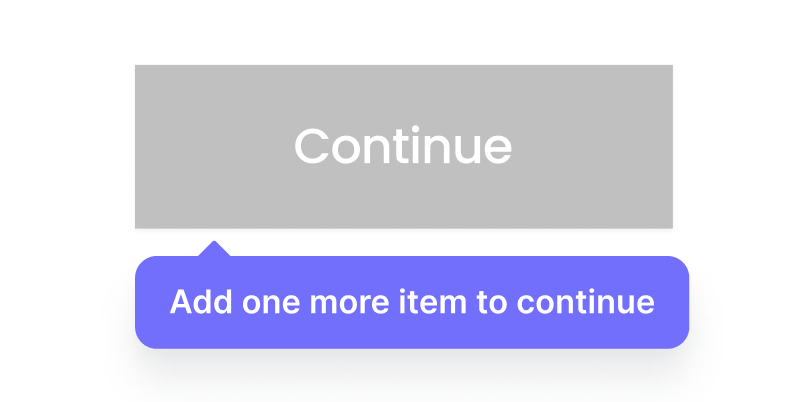
Use explanatory tooltips
As an example, on e-commerce website, you can provide a clue, such as "add one more item," next to the disable button so users can understand what is expected.
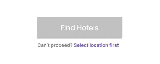
Provide supplementary context
Error states to improve accessibility and help the users understand what it expected, such as the value you entered has the wrong format.
Other ways
While we discussed the 2 most common ways to guide users, usually there are a lot of factors that can affect how a user perceives an interface. To address this matter and set you in a place where you can ensure anything will go as planned, I have set up a comprehensive checklist to follow every time you have to use a disabled button. Use the link below to download the checklist 📋.
Disabled Buttons Checklist
Since there are a lot of things to consider when you are about to create a new user interface or validate an existing one, here is a helpful list to ask and double check when designing an interface with disabled buttons:
- Default State: Should the button be disabled by default, such as when an item is unavailable?
- User Input Validation: If the button isn't disabled by default, can it remain enabled and validate user input upon submission?
- Default Values: Can default values be used to keep the button enabled initially?
- Disabling Criteria: When should the button become disabled, like to prevent double bookings?
- Interface Appearance: Should parts of the interface be greyed out when the button is disabled?
- Button Text: Should the button text change when it’s disabled?
- Color Contrast: Is the color contrast sufficient for the disabled button?
- Explanatory Note: Should there be a note explaining why the button is disabled?
- Focusable Button: Should users be able to focus on the disabled button?
- User Interaction: What happens if users hover over or tap the disabled button?
- Cursor Change: Should the cursor change to indicate the button is not clickable?
- Tooltip Explanation: Is a tooltip needed to explain why the button is disabled?
- JavaScript Prevention: Use JavaScript to prevent clicks with
aria-disabled? - Dynamic Content Announcement: Use ARIA live regions to announce changes in content?
- Error Guidance: How do we guide users if they encounter errors related to the disabled button?
- Re-enabling: How and when can the disabled button be re-enabled?
- Support Link: Can we provide a link to send user input to support if they are locked out?
- User Consent: Should we ask users for consent to be contacted for help?
- Inline Validation: Is inline validation (positive or negative) needed?
- Error Messages: When and how should error messages be displayed?
- Validation Bypass: Allow users to continue even if inline validation fails?
- State Update: Should the button's state update after every user input?
- Updating State: Change the button label and colors while it’s updating (e.g., “Updating…”)?
- Loading Spinner: Display a loading spinner while the button is updating?
- Click Listening: Stop listening to clicks after the first click, except for Undo buttons and steppers?
- Sticky Button: Can the disabled button remain sticky on narrow screens?
- User Tracking: Track how many users can't proceed and abandon the process?
- Design Testing: Test if a design without disabled buttons performs better?
Conclusion
We often follow established "best practices" without questioning whether they are truly the best approach or if there is an opportunity to create something better, particularly when it comes to design choices like disabled buttons. While commonly accepted as a way to indicate that an action is unavailable, disabled buttons can be frustrating for users who may not understand why they can't proceed or how to make the button functional. Instead of blindly adhering to this practice, we should explore more intuitive alternatives that enhance user experience, such as providing clear explanations, actionable feedback, or alternative paths to completion. This way, we can ensure our designs not only follow standards but also empower users.Use the list above to ensure that you get the most out of any user journey when it comes to decision-making and task completion. Stay tuned for more 🚀.