Level up your typography skills
Familiarize with typography terms and best practices
The Importance of Typography
Typography is the art and science of arranging letters, characters, and text in a visually compelling and communicative manner. Its significance lies in the fact that it can enhance the readability of information, highlight important aspects of the text, and even evoke certain emotions or moods in the reader. In essence, typography has the power to make people feel a range of emotions when they read something.
95% of the information on the web is written language. It’s more than obvious to say that Designers should master at least the foundation of shaping written information, in other words: Typography.
Typography Terms — Glossary
Typeface: A specific design or style of a set of characters, encompassing factors like style, weight, and appearance. Examples are Arial, Times New Roman, Helvetica, etc.
Font & Font Family: A font is a specific style and design of characters used in text. A font family is a group of related fonts sharing a common design theme, encompassing various styles and weights within that theme. (e.g., regular, medium, semibold, bold, italic)
Typeface Categories: Refers to the design principles a typeface follows. Famous typeface categories are Serif, Sans-Serif, Monospace, Displayed, Handwritten, Script, Humanist, etc.
Type Scale-Size: A set of harmonious font sizes used in a design to create consistency and hierarchy, often following a mathematical ratio. There are different units to measure type size, which can vary from design to development.
- Pixels (px): Fixed units for precise design control, but not responsive.
- Rems (rem): Relative units based on root font size, ideal for responsive typography and layout.
- Ems (em): Relative units based on the parent element’s font size, versatile for scaling within components.
- Designers: Prefer pixels for precision, sometimes use rem for typography.
- Developers: Favor rem for responsive design in development.
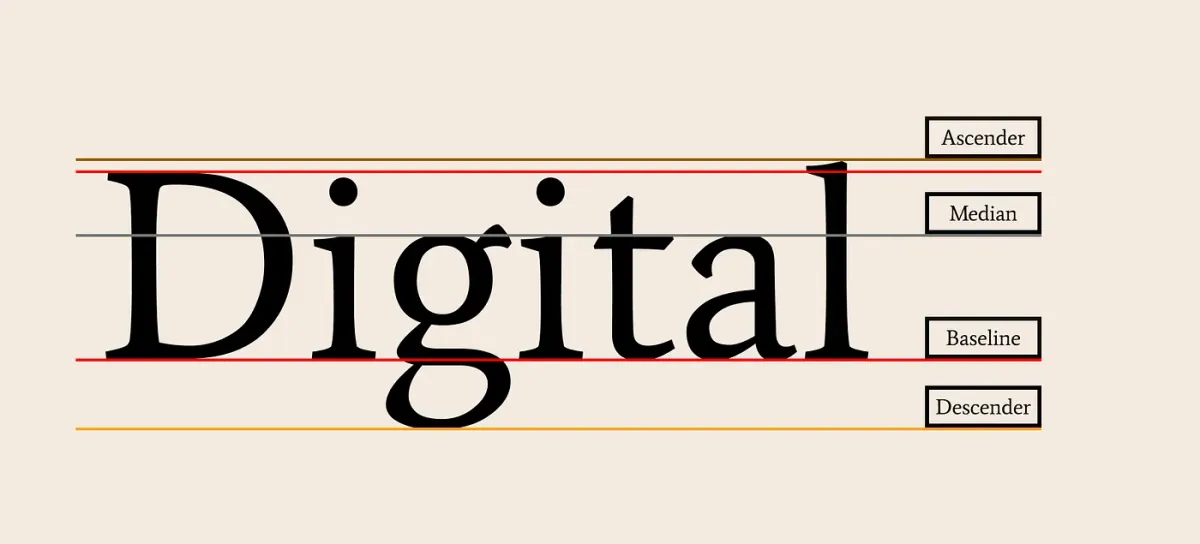
Baseline: The imaginary line on which the majority of characters in a typeface rest, ensuring uniform alignment and readability.
Mean Line: Also known as the x-height, it represents the height of lowercase letters, excluding ascenders and descenders.
Ascender: The part of a lowercase letter that extends above the mean line, as seen in letters like ‘h’ and ‘d.’
Descender: The portion of a lowercase letter that extends below the baseline, found in letters like ‘g’ and ‘y.’
Tracking: The uniform adjustment of space between all characters in a text block impacts overall readability and aesthetics.
Kerning: The adjustment of spacing between individual characters to achieve visually pleasing and balanced typography.
Ligature: A combination of two or more characters that are designed to flow together seamlessly for improved legibility and aesthetics.
Leading: The vertical space between lines of text. Leading is crucial when it comes to legibility. Well-designed leading can help the user’s eyes go from one line to another.
Tip: Proposed line height (Leading) 120%—140%
Negative Space: In typography, negative space stands for the space between blocks of text, such as different paragraphs and sections. Properly selected negative space can improve readability.
Recommendations & Best Practices
Be mindful of Font Pairing
When combining font families in your design, limit yourself to three font families at most. Font overuse can result in visual chaos and inconsistencies. Starting with a single font family can be a useful strategy for less experienced designers. Ensure that the selected fonts harmonize well with each other using tools like FontPair and Typewolf.
Establish a Visual Hierarchy.
Creating a clear hierarchy in your typography is essential. Prioritize content by using variations in font size, weight, and color. For the most important headings, start with h1> tags to effectively guide the attention of viewers.
Text Size Recommendations
Text size greatly affects the reading experience on screens. Avoid making text too small, as it can strain readers’ eyes and lead to information being overlooked, particularly on mobile devices.
- For Desktop, use 16px or larger for body text
- For iOS devices, aim for text that’s 11 points or larger.
- For Android devices, a minimum readable font size is 12sp, with 14sp being recommended.
Mind Line Characters
A block of text’s horizontal distance is measured by its line height. The effective reading of your text is determined by the number of characters on each line. Unfortunately, long lines are probably one of the most common design problems on the web. WCAG recommends keeping the line below 80 characters, where the ideal length is about 60 characters.
Minimize the use of text blocks
Users are used to scanning for information and usually feel intimidated by lengthy paragraphs or text blocks. To make content more readable and user-friendly, divide lengthy language into small paragraphs, utilize bullet points and headings, and highlight key information.
Avoid Excessive Use of ALL CAPS
Using all-capital letters, also known as all-caps text, means writing everything in uppercase. However, this style can slow down reading speed compared to using lowercase letters. To ensure better readability and comprehension, it’s advisable to avoid using all caps for text blocks longer than a single line.
Define Line Spacing
Pay attention to the line height, and the distance between lines. A comfortable reading experience is guaranteed by sufficient line spacing, which also improves readability. Avoid minimizing line spacing, which can lead to text feeling cramped and difficult to read.
Conclusion
To sum up, typography is the foundation of effective visual design and communication in today’s digital age. We explored the fundamental terms and essential best practices that help produce aesthetically appealing and user-friendly content. Remember, while typography is a vast field, mastering its foundational elements is the first step toward creating remarkable user experiences.
Continue experimenting, improving your craft, and expanding the possibilities of creative expression as you set out on your typography journey. With these resources at your disposal, it’s easy to create designs that are not just aesthetically pleasing but also profoundly engaging and effective. Happy design! ;)